Revamping the onboarding journey for a visually immersive and engaging experience
Project Summary
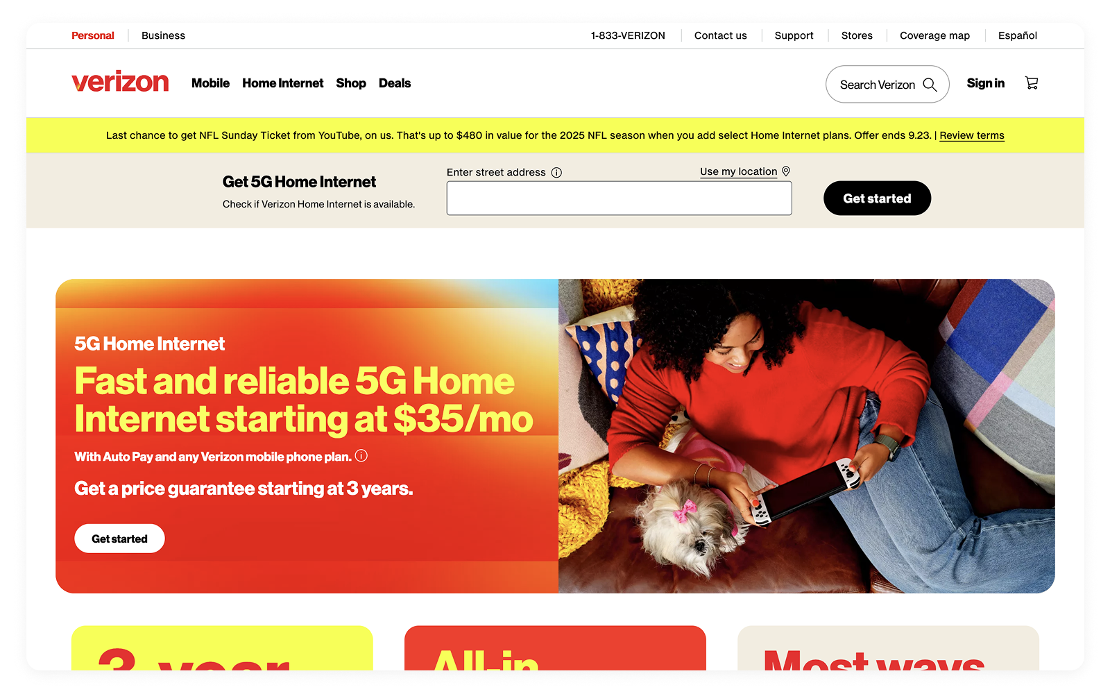
Verizon Home Internet offers Fios and 5G services to a diverse customer base through an online purchase journey. However, the existing buy flow had usability challenges that led to high drop-off rates, unclear eligibility, and reduced conversions. As the UX Lead, I was responsible for reimagining the journey of simplifying plan discovery, clarifying service qualification, and enhancing checkout flows to improve both customer experience and business performance.
The Challenge
Despite strong marketing efforts, the conversion funnel was underperforming due to:
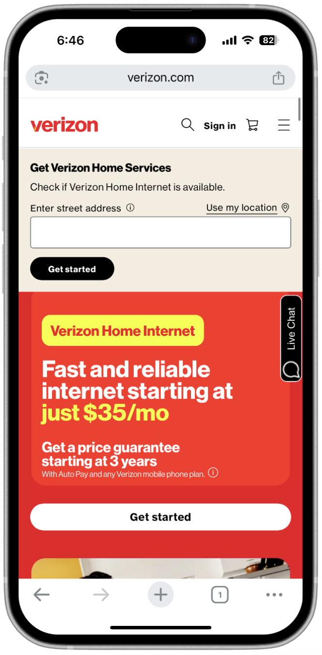
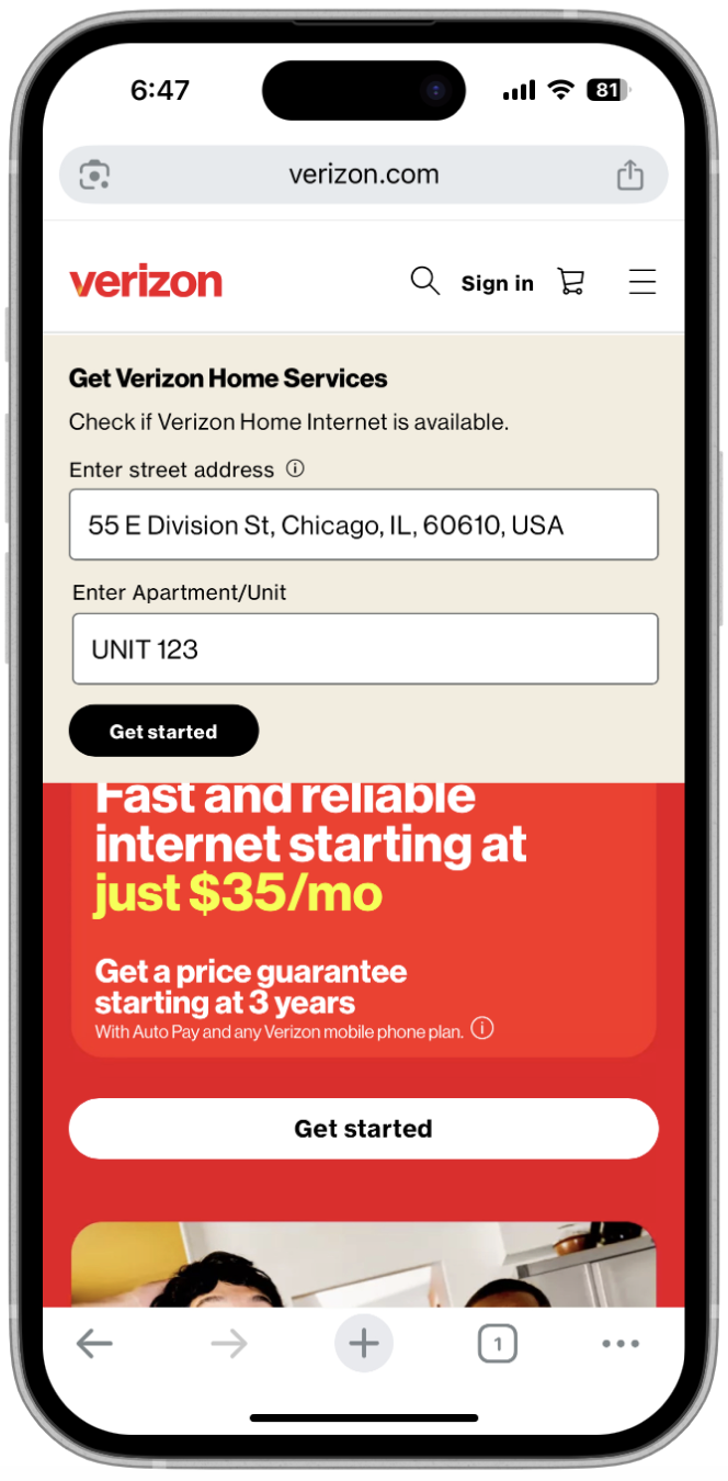
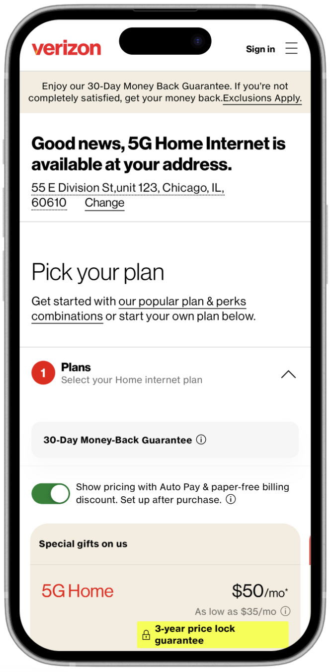
- Confusing address qualification between Fios and 5G
- Lack of personalization in plan recommendations
- Fragmented information architecture, causing decision fatigues
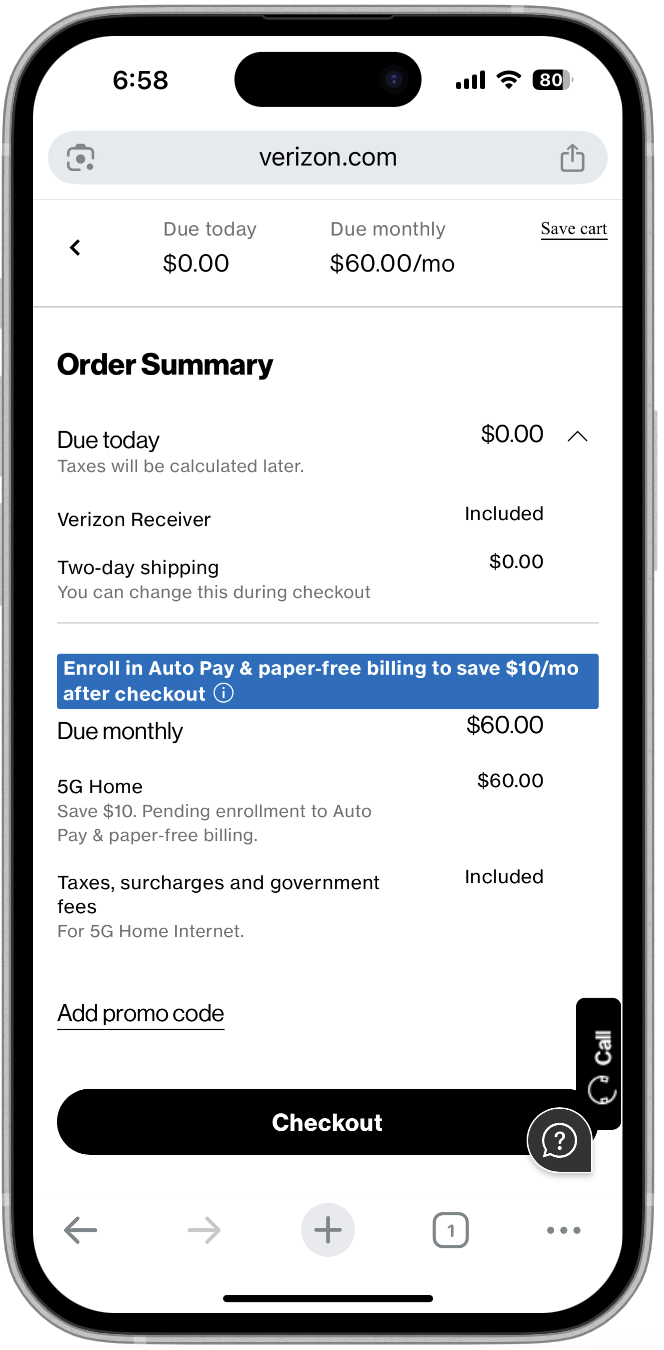
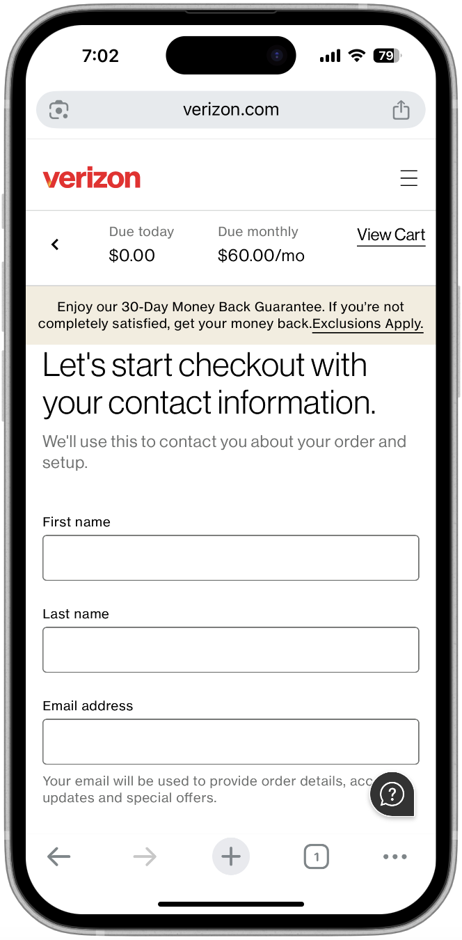
- High cart abandonment from unclear pricing and redundant steps
Design Constraints & Blockers
- Legacy platform limitations slowed back-end flexibility
- Strict compliance protocols constrained personalization efforts
- Cross-functional dependencies required constant alignment
- Inconsistent eligibility logic required iterative clarification with business
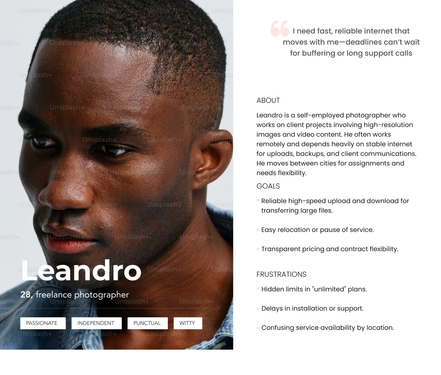
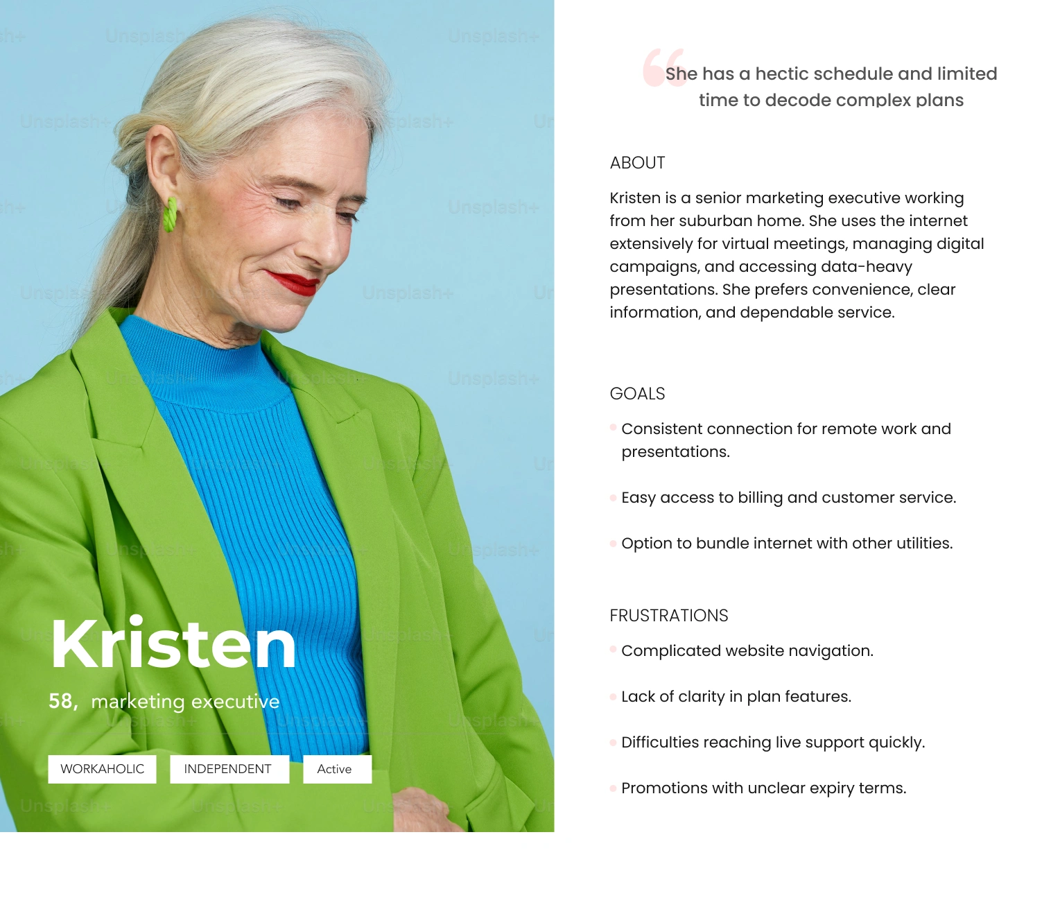
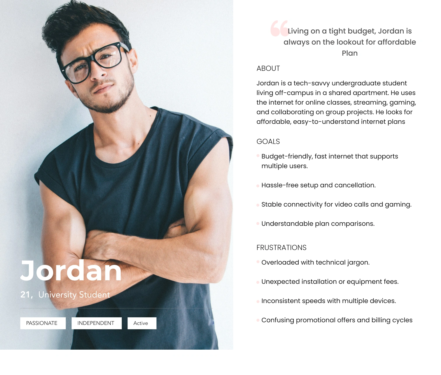
Personas
We wanted to form a deeper understanding of our users' goals, needs, experiences, and behaviors. So, we created 3 personas for each of our user segments. They were based on user interviews and surveys, and we kept updating them throughout the project as we gathered more data. We used these personas whenever we wanted to step out of ourselves and reconsider our initial ideas.
Design: How We Approached It
- Focused on clarity, consistency, and user trust, driven by research insights
- Built a modular UI framework adaptable to plan comparison, service checks and checkout
- Used progressive disclosure to simplify Fios vs. 5G eligibility and reduce cognitive load
- Developed scalable components within Verizon’s design system, adding accessibility enhancements
- Rapidly iterated in Figma on address lookup, plan tiles and checkout panels
- Delivered a reusable, intuitive UI foundation enabling faster implementation across journeys
KPIs with targets
Conversion Rate Uplift
Tracked the percentage of users who completed the end-to-end buy flow pre- and post-launch. A/B tests revealed an 18% increase in completed transactions compared to the baseline.
Drop-off Rate Reduction
Funnel analysis tools (like Adobe Analytics and FullStory) were used to measure exit rates at key steps. Address qualification drop-offs were reduced by 22% after redesign.
Time-on-Task for Plan Selection
Session replays and click tracking helped measure how quickly users selected a plan. Time spent on plan selection was reduced by approximately 25%, indicating improved clarity and usability.
User Satisfaction
Feedback indicated a notable improvement in user confidence and satisfaction navigating the flow.
Operational Efficiency
Tracked adoption of modular design components across teams. Reduced design and development turnaround time by enabling reuse and consistency.